
Introduction:
Globalization has brought countries together in more ways than ever before. Consumers, corporations and governments alike, now have generally unfettered access to innovations, markets, products and services. While the benefits associated with globalization are many, it also brings associated risks, as we have seen with the recent SARS-COV2 virus. Infectious disease specialists have been raising the alarm about the need for an effective and uniform response to these threats, due to the speed at which an infectious disease could spread as a result of our global connectedness.
COVID-19 (the disease caused by the SARS-COV2 virus) has completely taken over our lives, resulting in a material effect in the lives of countless global citizens. The question at the top of everyone’s mind is; “How do we adjust to this new normal?”
Specifically, what can we learn about patterns and prevention as we analyze how an infectious disease like COVID-19 migrates and assess how industries are impacted by its spread? This understanding can help inform public health directives that aim to control the migration of the disease, while at the same time alleviating resulting strains on the economy.
Study Objectives:
To develop a better understanding of these patterns, our Data Science teams at Inspired Intellect and WorldLink initiated an R&D project with the hypothesis that advanced analytics could uncover insights to address the above questions. We were also looking for pragmatic applications for deploying our findings to help our clients understand how their businesses would need to adapt to survive in the rapidly evolving new normal.
We focused our research efforts into 4 distinct tracks:
- Creating a data lake of information as a foundational pillar for our research
- Collating and categorizing experimental treatments, therapeutics and vaccine research into a semantic search-driven library of knowledge to support frontline healthcare workers and medical practitioners as they keep up with trending research in these domains (here)
- Social listening and associated unstructured text analysis to identify and surface trending topics and concerns people were talking about
- Machine learning and insight generation to identify the factors influencing the spread of virus to predict the waxing and waning of virus epicenters over time.
This article is Part 2 of a 2-part blog series focused on the 4th track above: Machine Learning and Insight Generation. This blog series is focused on answering the following questions:
- Why are certain counties/cities more affected than others?
- Why is there variation in mortality rates among the most infected counties?
- What are the underlying patterns and factors for virus spread and mortality?
In Part 1, we provided recommendations on how to mitigate the spread of infectious diseases, based on our work using county-level data and machine learning techniques. In Part 2, we will explore model data, features and insights.
We feel that a data-driven scientific approach can help answer these questions and, more importantly, inform decision making for a range of stakeholders:
- Policy Makers: Have sufficient measures been taken to ensure that the infection spread can be controlled? If not, how do we mitigate the risks?
- Business Owners: Is my business a potential contributing vector to the spread of the virus? What measures should we consider implementing relative to operating the business in a manner that is safe for employees and customers?
- Individuals: What measures can we as individuals take to help stem the spread of the virus?
Editor’s Note: This blog post was authored to highlight Inspired Intellect’s perspective on how the latest advanced analytics techniques could examine driving factors behind the COVID-19 pandemic and garner recommendations to inform officials in their policy responses. To do this, I co-authored this blog with my colleague, Prashanth Nayak, who serves as a Senior Data Scientist for our partner organization, WorldLink. There were several others across Inspired Intellect involved in the data sourcing and model development necessary to deliver these insights related to the pandemic and potential actions to mitigate its impact.
How We Explored the Data:
We began our research efforts with a data exploration exercise guided by a quantitative risk score, designed at the county-level. Our risk score design included county-level reported statistics such as:
- Rolling 14-day infection rates
- Mortality rates
- Population density (where the population density is defined against the habitable square miles).
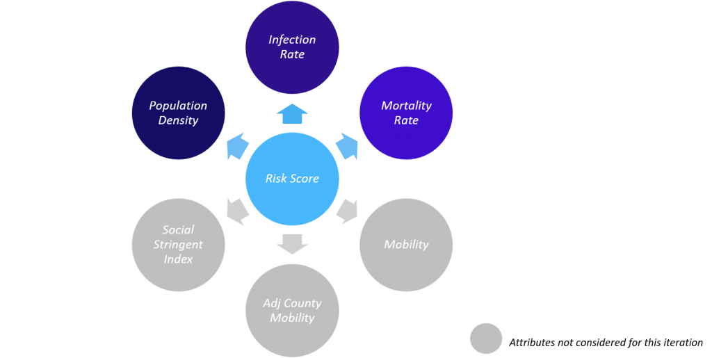
Other relevant attributes such as county-specific mobility, adjacent-county mobility and social stringency could also be included in the risk score design. However, we decided to keep our initial design simple with a view to helping us better understand the insights we encountered. The attributes were passed through a clustering algorithm to arrive at a categorization of counties that exhibited a similarity in infection rates, mortality rates and population density.
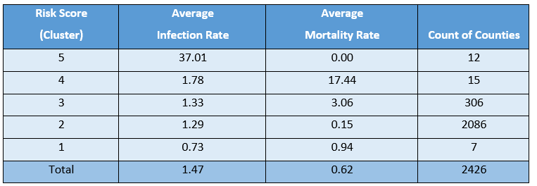
The Risk Score for the week of May 9th is shown below. Counties exhibiting the highest risk (i.e. high infection rate, high mortality rate and high population density) collected into Cluster 5. In contrast, counties exhibiting the lowest risk were collected into Cluster 1. To keep the design simple and due to a general lack of insight into COVID19’s pathology, we did not weight infection or mortality rate variables differently when clustering. Therefore, we can label a county as risky if either it has high infection rate or high mortality rate.
We examine a few counties within Cluster 5 to understand why they were categorized as highest risk. Data for relevant portions of the prior 14-day period (Apr 25 – May 8) that illustrate our arguments are shown below. We can see that the infections spiked from 2 to 14 cases in Tillman County, Oklahoma between May 2nd and May 3rd, and from 31 to 74 in Jackson county, Florida between May 7th and May 8th.
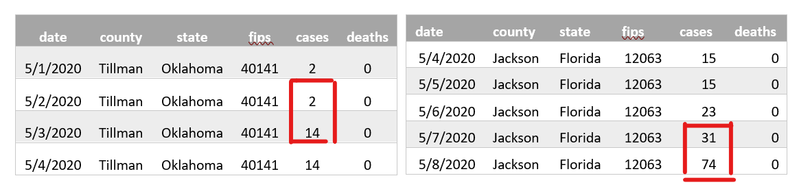
Table depicting spike in Cluster 5 counties
These counties demonstrated a noticeable and sudden rise in infections, indicating emerging virus hotspots and signaling the need for allocated resources. We use these two counties as prime examples of early signaling for an escalating hotspot, by using variables that are true of all counties, regardless of size. Note that many high-density counties were already subject to a mandatory shelter-in-place order during our 14-day evaluation period and were therefore experiencing decreasing infection rates throughout our study.
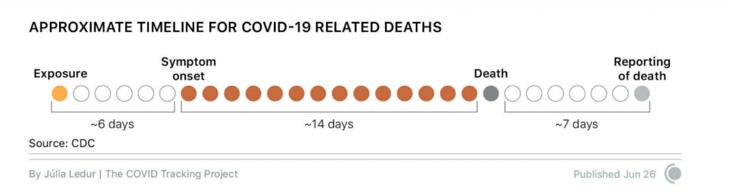
Next, we examine the migration of risk scores across counties when compared with the risk scores from the week of April 24th. The week of April 24th was chosen as our baseline based on anecdotal evidence that the virus has an incubation period up to 14 days. As seen from the color-coded map on the left, the areas of primary concern (as of April 24th) were concentrated in the southwest and northeast of the country, along with some pockets of higher risk in the south region around Georgia. Over the next 14-day period from April 25th to May 8th, the virus had traversed across the country. What is also interesting to note, is that the counties that were previously highest risk, appear to have gained some measure of control over the virus spread. Although these were largely reactive measures, there is much that can be learned from the success of measures these high-risk counties put into place in response to their situation.
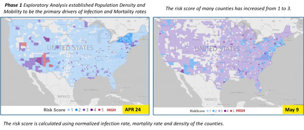
In summary, we see that the risk score can be a helpful tool to guide public health policy decision-making. The downside is that it reflects what has already happened, and the best public health policy makers can hope to do is intervene to prevent the situation from getting worse. The truest value-add from data analytics lies in surfacing what factors influence the risk score, so that decision makers can be more proactive in their approach to control the spread of the virus (i.e. implementing sweeping safety procedures in and around airports, where people are highly mobile across counties).
Feature Engineering:
We began our predictive modeling exercise by formulating hypotheses to be investigated. Before the first COVID-19 cases were recorded in the US, medical researchers across the globe were already providing valuable anecdotal evidence published through trusted medical channels. In parsing these via text analytics, these were tremendously useful in guiding our hypotheses design.
The following data were of primary interest to our research:
- Age
- Gender
- Health equity
- Travel exposure
- Social mobility
- Healthcare supply/availability
- Adherence to public health policy directives
Of course, some attributes, such as health equity, presented data acquisition challenges that required creative data engineering. We therefore had to scale back our expectations or rephrase the hypotheses in terms of viable data proxies in a few specific areas. As an example of the latter, we re-phrased hypotheses related to health equity through the lens of county-level demographic data attributes. Similarly, due to inconsistent data reporting on adherence to public health policy directives, we eliminated it from our consideration set.
The resultant inventory of hypotheses influenced the data collection and associated data enrichment efforts. These are succinctly illustrated within the accompanying graphic, through a layered feature list.
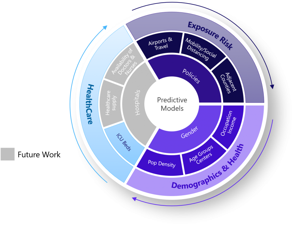
Feature Importance:
The representation of an analytic challenge as a machine learning algorithm, and the richness of the features feeding the algorithm, have a direct relationship with the insights gleaned from the model. Accordingly, we now examine the machine learning algorithmic construct we selected, and the features that dominated our models:
- Target Variable: The target variable describes the analytic objective to be pursued. The viable alternatives in this context would be to estimate the infections or mortalities (i.e. a regression) or to predict the increase/decrease outcome in the infection rate or mortality rate (i.e. classification). To keep it simple, we settled on the classification approach, and, predicted if the rates would increase/decrease over the next two weeks. Two separate models were developed, one that predicted the increase/decrease outcome in the infection rate, the other that predicted increase/decrease outcome in the mortality rate.
- Independent Variables (or Features): The independent variables explain the variance in the target variable and the degree to which they account for the variance. An examination of the independent variables provides the insights derived from the models, which in turn guides decision makers. The table below arranges the independent variables in order of their significance in the models.
Monitoring all these factors can help policy makers formulate and evaluate strategies to contain COVID-19 spread and develop preventative measures for those counties most at risk
Model Validation:
While there are some exceptional factors responsible for the infection spread, the above features collectively provide a holistic explanation for the spread of COVID-19 across the US.
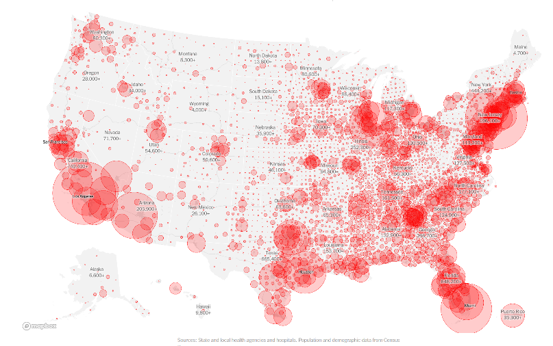
Source: https://www.nytimes.com/interactive/2020/us/coronavirus-us-cases.html
As an example of an outlying factor that contributes heavily to infection spread and could create inconsistencies in the model if not monitored, , the correctional institutions in two Ohio counties (Marion and Pickaway) led to these two counties becoming hotspots. The visualizations provided by the NY Times (here) from the week of May 11th provides as visual confirmation of several key features in our models (population density, proximity to major airports, prevalence of seniors, regions dominated by a high-degree of mobility or a disposition towards underlying health conditions, due to various socio-economic or demographic factors)
“…while the individual man is an insoluble puzzle, in the aggregate he becomes a mathematical certainty.”
― Arthur Conan Doyle, The Sign of Four
In general, week over week, our predictive models corroborated well with the county-level COVID-19 trends. To demonstrate the relative accuracy of models, validated against emergent data, we now pick two counties from different states to analyze the effect of features that were deemed important by our models. Not all counties of these state have been, or is, an emerging epicenter.
- Harris County in Texas (Left): Harris County had considerably lower infection and mortality at the start of pandemic. There was limited stay at home order because of which we see the virus spread increasing in the county in following weeks.
- Suffolk County in New York (Right): Suffolk County was a virus epicenter in March and April. The state had undertaken strict measures requiring face coverings, and we can see the resulting impact through the drastically reduced infection and mortality rate.
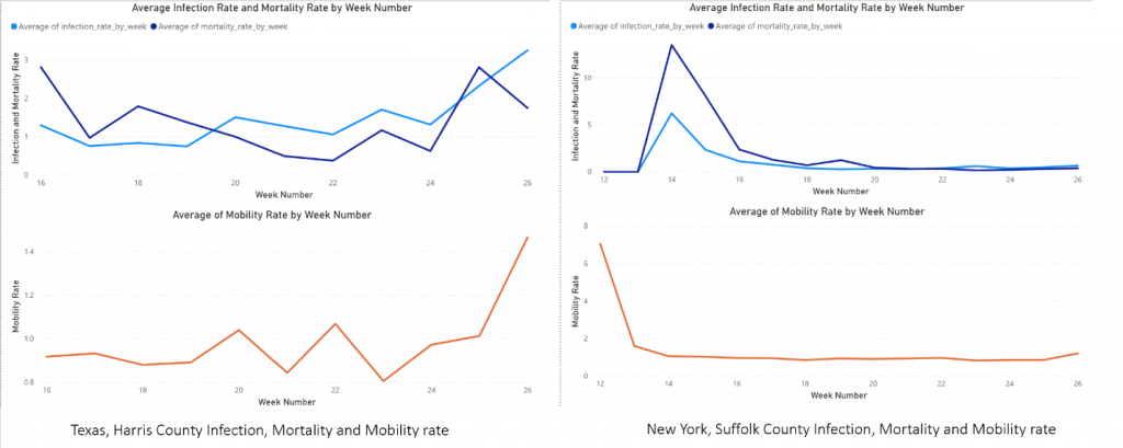
We can see for both the counties the increase in mobility is followed by the increase in infection and mortality. In the case of Suffolk, the mobility decrease is followed by a decrease in infection whereas in the case of Harris County, every increase in mobility is followed by the increase in virus spread. The lag between the 2 charts can be explained by the 14-day incubation period for the virus.
Conclusion:
Understanding the driving factors that affect infection and mortality rates are critical insights that can lead to both preventative and prescriptive actions. We note in this article the resulting effects generated by factors such as:
- Age
- Gender
- Health equity
- Travel exposure
- Social mobility
- Healthcare supply/availability
- Adherence to public health policy directives
Using Advanced Analytics techniques, our objective is to equip policy makers, businesses, and individual citizens alike with the insights to minimize the spread of infectious disease and create data-driven, actionable guidelines that will help us emerge on the other side of this pandemic.
Inspired Intellect is an end-to-end service provider of data management, analytics and application development. We engage through a portfolio of offerings ranging from strategic advisory and design, to development and deployment, through to sustained operations and managed services.
Inspired Intellect is part of the Adi Group. The Adi Group is a collection of companies that, collectively, advises on and implements enhanced technological capabilities for enterprises along their digital transformation journey. Members of the Adi Group include:
- WorldLink
- Inspired Intellect
- The ADI Family Office
- The ADI Foundation
Inspired Intellect’s membership in the Adi Group allows its clients access to a broader portfolio of digital transformation solutions and multiple touch points with innovation.